Changelog #22 - November 9 2019
CSS updates and main navigation enhancementsThe November change release for Drupal will reveal slight updates to the general CSS for the footer and header in the default and hybrid themes. The CNAS theme also has quite a few fixes. Code has been cleaned up and adjustments in aria labels and landmarks were made. A new admin theme, Claro, has been introduced. A notable enhancement has been added to the main navigation. Advanced options to aid in customizations are available.
CSS Changes
- Main menu text is slightly more prominent
- Audience menu navigation color slightly lighter blue and the drop down links appear more prominently and align right instead of left.
- Footer is slightly darker with the titles a brighter white and padding a bit tighter
- The main content background color is a shade darker than the slight off-white. (#fafafa)
Theme Setting Updates
Site builders will see new theme settings when in the Appearance tab. Theme new settings and configurations can be found by clicking on the "Settings" link for the theme that is active.
Main Menu Options
The main navigation menu now has several options. Decide whether or not the "sticky" nav is available on desktop and/or mobile. Main navigation now has a Meganav display option. You'll still need to use columns to create the meganav but will no longer need to use the separate "Mega navigation" block. The "fluid" option allows you to set your nav items to the grid or beyond the grid (fluid). The "special highlight" is that section you see on ucr.edu, the "Find Information For". The meganav styling can also be divided into the number of columns you need between 2, 3, and 4. Category titles can also be given to each column of the meganav.
Theme Help
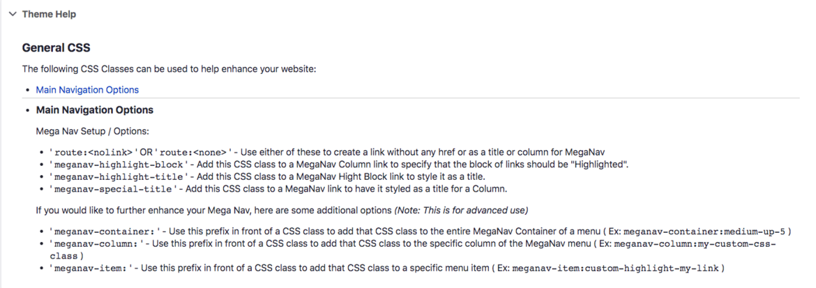
Not sure exactly how to set up the MegaNav? Check out the "Theme Help" section under the Appearance settings.
Advanced Options
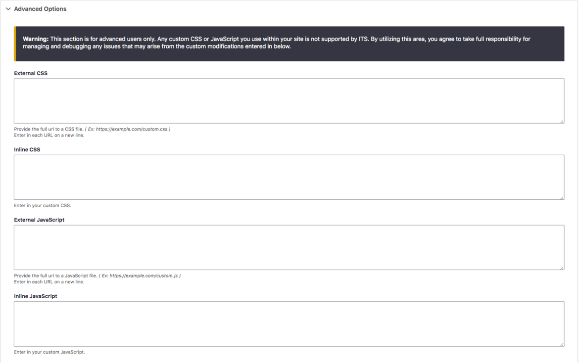
Properly add global CSS and Javascripts - even from external sources! This will place these scripts where it needs to be in the head section. Please be aware of the warning. If your styles and scripts do not play well with Drupal's, we offer no technical support. Use with caution.
Articles Categories and Tags
There is a new custom block called "Topics List" which will display either categories or tags on your pages. This block is meant to be placed on your article listing pages.
Admin Theme
A new administration theme is available. The Administration Theme is set to "Seven" (Appearance tab for Site Builders). The new theme that can be used is "Claro". Other admin themes should not be used. The Claro theme is more flat and modern. Nothing has moved but the look is different. This new admin theme is also responsive so if you are in a pinch, you can now edit on your mobile device. Please note that changing a theme is on a site by site basis, not by user.
CNAS Theme
Here is the list of updates for the CNAS Theme.
- Tables: Can show sort and search fields now.
- Sticky Apply Now button blocks can be placed in the Site Notification region.
- Style Article Preview listing page.
- Proper resizing of height for hero video. Adjust the timing of when jQuery fires.
- Remove the max-height set on the mobile menu so all top-level menu items show now.
- Fix the default colors set for Expanding Cards. They can still be overwritten through the html editor color options.
- The Blue Gradient on CNAS themed carousel sliders was too tall on mobile and is now fixed.
- Fix for profiles.ucr.edu CNAS style to set Name info on a separate line from the photo for mobile devices.
- Mobile: Fix for the site name running into the logo for screen-widths less than 400 pixels.
- Expander cards had a maximum height which did not grow to accommodate long text. Max-height setting has been removed.
- Added View Mode ‘CNAS CTA No Margin’ for CTA blocks. This styles the CTA boxes without margins so that we can make a row of boxes look like one big image. See https://cnas.ucr.edu/give
- Fix for Basic Blocks in Layout Builder which were not getting 100% height in multi-column rows.


