Getting Started
To get started, the Gutenberg module must be enabled for your site. Please reach out to Campus Web Solutions to enable this module for you.
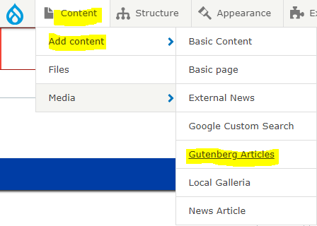
Once the module is enabled, go to the admin toolbar, and then hover over Content, hover over Add Content, and then click on Gutenberg Articles:
The User Experience
Gutenberg offers a totally different user experience compared to our other content types. Here are some additional settings that can make the experience a little easier.
On the top-right corner of the Gutenberg editor, you will notice these buttons:
| Preview link | Gutenberg feature. This gives you an option to preview your article in Desktop, Tablet, or Mobile |
| Toggles the right bar menu on and off | |
| More Settings. See table below. | |
| Save button | Saves the article |
| Preview button | Drupal feature. Previews the article according to its view mode (default or teaser). You can ignore this |
| Delete | Deletes the entire article. |
Views Settings
Click on the 3 dots to expand More Settings. We'll be focusing on the different Views you can enable to make your editing experience easier:
| Top Toolbar | Top Toolbar. Helpful for keeping the context menus of each block stay in one place. If this is turned off, the context menu of each block will appear as you hover over that block |
| Spotlight Mode | Focus on one block at a time. This is very helpful for concentrating on one particular block. Other blocks you're not working on will be greyed out slightly. For new users of Gutenberg, we recommend enabling this option |
| Full screen mode | Toggles the Drupal admin toolbar. We recommend enabling this |
Basics
The Add Block Button
With Gutenberg, you will treat every piece of content as "blocks". These blocks can be moved around your page wherever you want to place them.
Note: Please don't confuse this with our custom blocks (Accordions, Call to Actions, Expanding Cards, etc.)
The Add block button will be noticeable as a plus ("+") sign in a black box:
Press this and you will get a panel of frequently used features for Gutenberg that you can place on your article.
Click on "Browse all", and a window on the left will open containing the different blocks available to Gutenberg.
Please note that some features might not look as good when displayed in the final output of the article. We'll need to style those.
Context menus
Each block available in Gutenberg has its own context menus. These are additional settings that you can apply to a particular block.
These menus will appear on the top of the page and on the right menu. Simply click on a particular block to access its context menu.
In the example below, the image is selected (notice the blue outline).
On the right, under the "Block" tab are some more styling options for the chosen block.
If you have Top Toolbar disabled (see table under Views Settings) , the context menu will be floating on each block:
Gutenberg Features
The Gutenberg module offers a lot of features out of the box. Click on a tile below to learn more about the frequently used features and how to create them for your article.

