Articles Preview Custom Block
Article Preview Blocks
Article previews, or teasers, are blocks that will display specific articles in a grid or snippet list view. These can be placed on other pages, such as the home page. Custom blocks can be created to display articles in a variety of ways including a minimalist view and slideshow.
View the different Article Preview Blocks
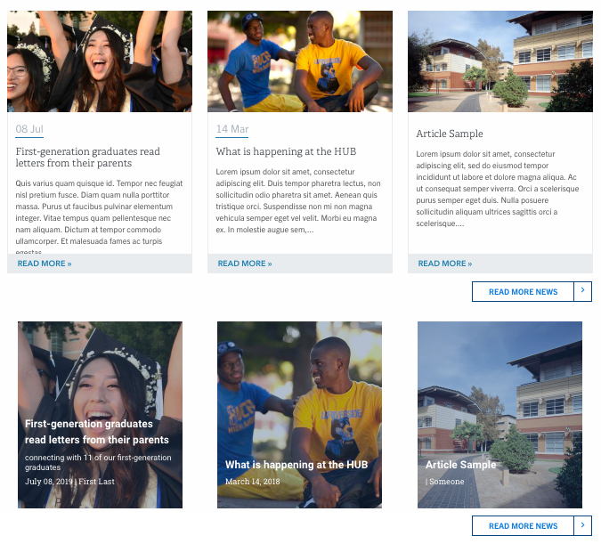
Here is a screenshot of two different display options. The first one is displaying the latest news articles in the standard view and the second is displaying the latest news articles in the block image view.
The old Auto Blocks for Articles are deprecated. They will continue to exist but no new articles will display in those blocks.
Create an Article Preview Custom Block
An article preview can be created before articles are created. However, if no articles exist under that type or option, there will be a label stating there are "no articles" to view.
- Navigate to Content -> Blocks
- Click on the +Add Content Block (blue button)
- Select Articles Preview
- Give the block a name. Campus Web Solutions recommends you name the custom block with a description in mind. For example, if you are making a latest news article block showcased in the minimalist view, name it something like "Latest News Minimalist".
Preview Options tab
- Article Type - Select the article type to display. This can be one of the original article types (news, blog, press-release) or one that was created using the Article Types Taxonomy.
- Show - Decide what to show. Latest Articles will display the most recent articles. If Featured or Spotlight is selected, only those articles specifically set as featured or spotlight under that article type will display. The Related Articles will ONLY work when placed on an article page itself.
- Display As - Select how to display the block. The choices are "standard", "standard alternative", "block images", "minimalist", and "slideshow".
Please note that Block Images and Slideshow will NOT display unless a header image is used on that article.
Standard - Most common, will display date, title, and summary
Standard Alternative - Best used when displayed one per row. It's the same as the listing view with image on left, title date, author, category, and summary.
Block Image - Great for full width content, displays faded image behind text, text includes title, subtitle, date and author. Needs an image in the header of the article to display.
Minimalist - Good for sidebar content, only displays title, subtitle, date, and author
Slideshow - Automatically rotating slideshow view that uses the image as the background, displaying one article at a time, date first, then title and subtitle. Needs an image in the header of the article to display. - Display per row - Select how many articles to display in a row (in mobile, they will stack), keep in mind the content area you will be placing this preview block in. Minimum selection is one, maximum selection is four.
Maximum to show - Up to 10 articles can be displayed at once, these will stack according to the display per row option. - More Link - Determine whether or not to show a "read more" link. The URL field can be linked both internally and externally (remember that your "news" pages will have a path of /news, "blogs" as /blogs). Type in what you want the link text to read that will show for your visitors. Finally, set the alignment for the link.
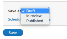
- Be sure to change the state as necessary in the "Save as" field. By default, it will be in draft and will not display to visitors of the site until published.
- Click Save
Introduction Tab
Optional content can be placed in the editor of the introduction tab. This will display above the grid/list view you are placing. This introduction content is part of the same block.
Style Options
Optionally change the default padding and margin. The padding will alter the spacing of the content inside the block space, the margin will alter the space between the block and other blocks on the page.


