Info Card Grid Custom Block
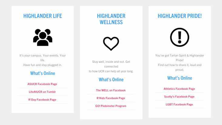
The Info Card Grid is a custom block component that allows for card looking sections of content in a grid format. The Info Card Grid can be used to display content of like information, or important content you'd like to highlight, in a nicer style, rather than simply listing out content on a page.
Example
- The grid will have a light gray background
- The grid background will auto adjust height to the longest card
- On hover, a slight border will display on the card
- Everything added to a card will automatically center display
- If using a list, all list items will have a dashed border that will span the card
How to Create an Info Card Grid
Editors and Site builders are able to create info card grids. It is an option in the Custom Block Library. They can also be created as an inline block using Layout. Once an Info Card Grid has been created, it will be added to the custom block library.
Custom Block Library
- On the admin panel, navigate to Content -> Blocks
- Click the "Add content block" button
- Select "Info Card Grid" from the list
- Give your Info Card Grid a unique custom block name
- Enter the number of cards you want to display across the page (Options: 1, 2, or 3). On mobile, these will stack, one on top of the other.
- Add content to the first Info Card
- Click "Add Info Card" to add another card
- Continue adding content to the card using the WYSIWYG (edit toolbar) and adding additional cards as needed.
- By default, the block is in draft and will not display to those viewing the site, only to authenticated (logged in) users. Once you are ready for the updates to publish, change the state to "Published".
- Click Save
