MegaNav Menu
What is a Mega Menu?
A mega menu is a drop down, expandable menu interface that is triggered by the user hovering over a link or defined area. This differs from a regular menu in that the panel is full width, showing various options, and often groups related links and content into categories or columns. This is also known as the MegaNav.
The MegaNav Main Navigation option under Structure -> Menus has been deprecated. It should no longer be used. If you are currently using the MegaNav Main Navigation option, please update your MegaNav using the procedures below.
What Does It Look Like?
After deciding on your main menu items that show in the horizontal menu across the top of the site, sub links can be displayed in four different columns. This allows site builders to group content for users. The drop down interface spans full width of the screen, expanding the menu's capabilities.
The below image is an example of what the mega menu will look like using all four columns. The "Find Information For" is a special section restricted for the main UCR website only. The site builder decides how many links to appear in each column.
Using the MegaNav
A site builder will be able to switch the theme's settings to use the MegaNav. In the Appearance tab, click on the Settings for the theme that is being used. Navigate to the Main Menu Options and click to open the expander. Select the "Enable Mega Navigation Display" option. Optionally select "Enable Fluid Mega Navigation" to render as full width.
Build out the MegaNav
Once the Main Menu Options for the theme have been updated to enable the mega navigation display, there are a few changes that are necessary in order for it to be displayed and function correctly.
- The menu link for the item to be expanded needs to be created. For the example, it would be the "About" link. Fill out the link as appropriate. It could be the overview page for the "About" content. Be sure to check "Show as Expanded".
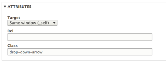
- In order for the arrows to display, the class field needs to be populated with the text "drop-down-arrow". The class field is found under attributes.
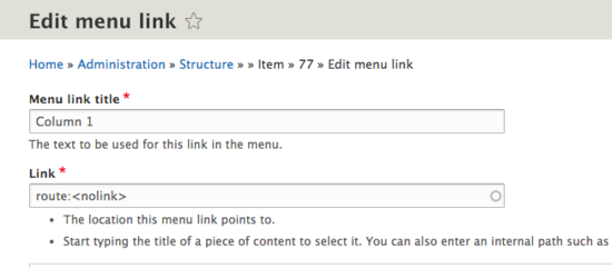
- The MegaNav needs to know what links to place in which columns. There are four different columns. These are labeled, "Column 1", "Column 2", "Column 3", and "Column 4". To get columns to work in the MegaNav, a menu link item needs to be created for each column. Create a link with the menu link title as "Column 1". Make sure that each of the columns have "show as expanded" checked, since they also have "children".
- The "Column 1" link will need to link to "route:<nolink>". (This goes for all the column links: "Column 1", "Column 2", "Column 3", and "Column 4".)
- Make the Column 1 link a child of the link item that needs to expand to the drop down. This can be accomplished by select the parent or in the menu view, indenting the item.
- Add menu links per normal for anything that should be in the first column. These should be children (or subitems) of the column.
- Repeat steps 2-5 for all columns that you wish to use, up to column 4.
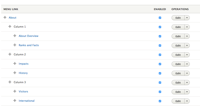
The following image is what your MegNav menu should look like. Notice the order - "About" will be the expandable main menu item, columns are indented and have no link, indented further are the items that will be displayed in those columns.


