Teaser Callout Custom Block
What is a Teaser Callout?
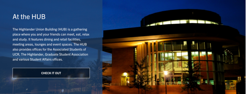
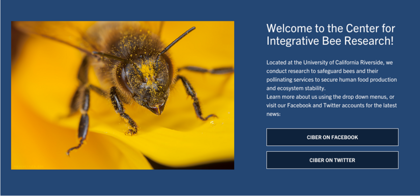
A Teaser Callout is a custom block component that allows for information to be highlighted on a page with brief text, optional button style links, with a nice background image or color. Users can select an overlay color based on the available palette, determine its ratio, and decide if they want the text on the left or right. Teaser Callouts are great for attention grabbing content. There are many possibilities with this flexible custom block.
Things to note
- Teasers span the full content area or column you place it in
- Text color and background color can be selected from a palette of color choices
- Title, description, links, media, and background can be added to a Teaser Callout
- If links are added to the "callout links" area, they are automatically styled
- Callout Media will be centered on the opposite side of the text and will not stretch as a full background
- Text can either be on the left or right
- Make sure your text is easily readable since you can control the background color
How to Create a Teaser Callout
Editors and Site builders are able to create Teaser Callouts. It is an option in the Custom Block Library. Once a Teaser Callout has been created, it will be added to the custom block library.
Using Custom Block Library
- On the admin panel, navigate to Content -> Blocks
- Click the "Add content block" button
- Select "Teaser Callout" from the list
- Continue to Building a Teaser Callout
Building a Teaser Callout
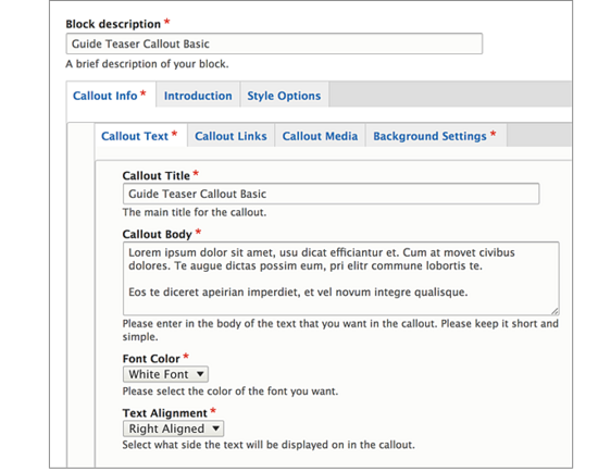
Give your Teaser Callout a unique custom block description
Callout Text:
- Enter a title, and the body for your teaser, remember that the body should be brief. The longer your body text, the longer your teaser callout will stretch. Notice this is no editor for the body, this is by design.
- Select your text color, the selected one will display larger.
- Choose your text alignment, either right or left.
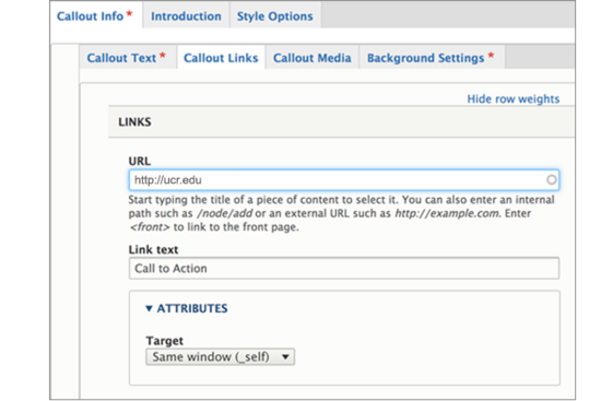
Callout Links:
- Optionally add links, which will turn into buttons at the bottom of your teaser, under the body. This will be displayed as a list of links.
- If you need more than one, click on "Add another item". The URL field will search for a node or if linking externally, make sure you use the full URL including the "http".
Callout Media: This is optional. If you want an image on the opposite side of your text that will center, use a callout media. This will not be the background. The optional media can search through the library, you can upload an image, or create an embed. Be sure to click "Place" when you have made your selection.
Background Settings:
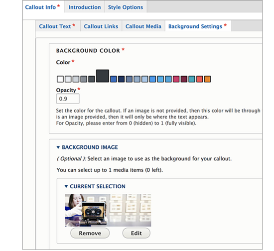
- Click on "Background Image" and then "Select Image" to open the library or upload a new image. An image is optional. You can decide if you prefer your teaser only have a background color. If you select an image, your background color will then serve as an overlay for the image on the side where your text will be placed.
Keep in mind, your image should be wider than it is long. Focal point does not factor into Teaser Callout background images.
Notice the opacity option under background color. Select a decimal between 0-1. The number "1" will display the background color behind the text and will allow no background to show through. If you want some background to show, select anywhere from .1 to .9. A "0" will not display a background color at all.
By default, the block is in draft and will not display to those viewing the site, only to authenticated (logged in) users. Once you are ready for the updates to publish, change the state to "Published".
Click Save.
