October's update to our content management system is substantial. On Saturday, October 6th, new features and enhancements were added to campus websites using the default profile. More information on each of these enhancements will be coming soon and be linked from this blog when available.
What's New?!
Full Width Layouts
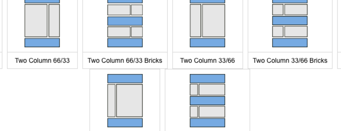
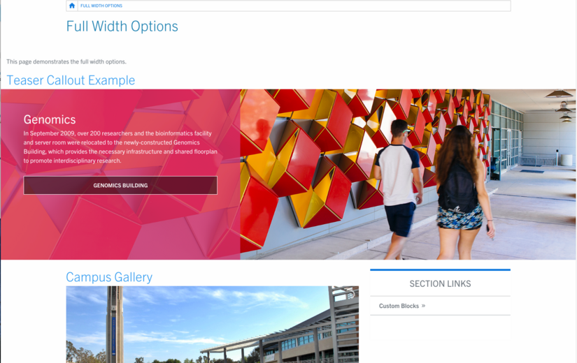
The layouts for the basic page content type have expanded, in that your content can expand to "full width" of the page, rather than being contained within the set grid. What does that mean? Now, any full, non-columned, region by default will span the entire screen size. For certain blocks that are placed, this can be changed and do not have to break out of the confines of the grid, except for its background. There will be an option to "center" content in a view mode using the gears icon for that block. Take a look at the layouts; regions in blue can expand full width, regions in grey (columned regions) will continue to be fixed to the grid size.

Internal Site Search
There is now a way to give your visitors an option to search just your site! In the configuration settings under UCR Custom Site Settings, a new tab is available. Site builders are able to include to update those settings to include the website URL and the new Search Results page. Once updated, the following image is what the visitor will see once they click on "Search" (either at the top or footer). There will be two different choices, to search all of UCR or just that site. Try it out on websites.ucr.edu!

Button Bar Custom Block
An additional custom block has been added to the selection. It is called "Button Bar". If you need a simple grid of buttons, you can use the Button Bar. There are three different button styles to choose from and you can decide on how many buttons to display in a row.

Changes
Auto Blocks and Custom
These two selections refer to "Manage Content" in the Panelizer tool. Previously, there were three sections where you could find these blocks, now there are two with an easier naming convention. Everything in your Custom Block Library will be displayed under "Custom". All blocks that are automatically generated by Drupal will be located under "Auto Blocks". These Auto Blocks include article and event blocks that are generated once an article (blog, press release, or news story) or event is created within Drupal. Tag and category term lists can also be displayed on pages when appropriate. Site builders can also add these through block layout to non panelized pages (perhaps you want to see all related categories on the article listing page). Below is the full list of Auto Blocks as shown using Panelizer.

Bug Fixes
- List item text was not formatted properly in accordions. Now the text will match the color and style of the brand.
- Additional menus that are placed within the primary content region can now collapse in mobile view. This will help maximize space.
Previous Changes
Here are a few updates from September that you may have missed.
- Localist Events Widget custom block available
- Tables are now responsive by default