Carousel Slider as Hero
What is a Hero?
A Hero is an image, slider, or video that displays at the top of a page. The Hero will span the full width of the page and be located directly under the main navigation. In the Block Layout, this region is called the "Hero Panel Content".
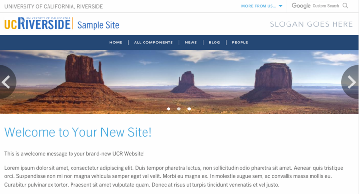
Here is a basic page. This basic page displays the hero slider in its default (small) view.
Hero Slider on the Home Page
A block may already exist in your site called "Hero Slider" and it uses the Carousel Slider type. Do not delete this block! Upon site creation, there are no slides within this hero slider. Once an image or video is added, the home page will display the hero. If a carousel slider that will act as your hero slider has not yet been created use the Carousel Slider instructions to create one. Note: Any carousel slider created can serve as a hero slider for ANY page of your site.
Adding Slides to the Hero Slider
Editors and Site Builders have access to the custom block library and will be able to add images or video as slides to the Hero Slider block.
- In the admin panel, navigate to Structure -> Block Layout -> Custom Block Layout
- Find the "Hero Slider" block (or the carousel slider you wish to use). The block description reads "Hero Slider" using the Carousel Slider block type.
- Click on "Edit" under Operations.
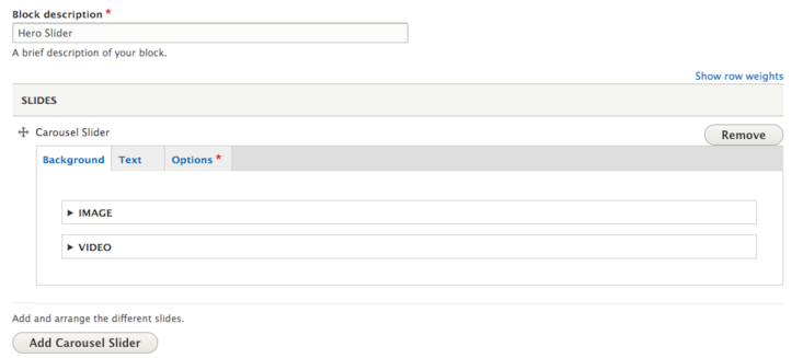
- When first seeing the Hero Slider, you'll notice there are no images/videos defined yet. You can either add an image or video. To add an image or video, locate your first carousel slider and click "Image" or "Video" to add. (Please note that if you decide to use a Video, you can only have ONE video; it is not recommended to have multiple slides when using video. This is due to sliders auto scrolling after a certain number of seconds.)
- Select the image from the browser window, either choosing an image already in the library or uploading an image. If video was selected, select the video entity you added to your library.
- Click over to the "Text" tab if you want to display a slide caption (title), subtext, and have a link on the slide. In the "Options" tab, you can then decide if you want the text to display left, right, or center.
- Once an image has been added, you'll see a hero banner, if that is what you want, stop here and click on the "Save" button at the bottom. If you want a slider, add new slides by clicking the button, "Add Carousel Slider".
- For a slider, rather than hero, continue adding an image to each "carousel slider".
Removing Slides
To remove carousel sliders from displaying, it isn't enough to remove the image, you will need to click on the "Remove" button to the right of the slider you wish to remove.
Hero Panel Content
As mentioned above, the Hero Slider has already been placed in the Block Layout region called "Hero Panel Content". It has been restricted to only show on the "<front>", or landing page. This is why once slides are added, it automatically displays. Changing the visibility of the Hero Slider to display on multiple, or all, pages is possible. Aside from what pages the slider can be viewed on, this is where the height of the slider can also be updated from default (narrow), to medium, or large with the View Mode. Editors and Site Builders also have the ability to create additional carousel sliders that can display on various other pages of your site.

Change Visibility of Hero Slider
Changing the Visibility (restrictions) of the Hero Slider can be managed by Site Builders.
- Navigate to Structure -> Block Layout
- Find the "Hero Panel Content" region
- Next to "Hero Slider", click Configure
- In the Visibility tabs, select either what content types to restrict the slider or select pages. The landing or home page is added by using "<front>". You can also use paths and add an asterisk.
- Click "Save Block" when finished.
Change View Mode of Hero Slider
- Navigate to Structure -> Block Layout
- Find the "Hero Panel Content" region
- Next to "Hero Slider", click Configure
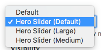
- Under "View Mode", select from default (250px high), medium (450px high), or large (730 px high). Note that in default, small view, subtext will not display, only caption (title).
Creating Additional Carousel Sliders as Heroes
Additional carousel sliders can be created and then placed in the Hero Panel Content to become hero sliders as well. Or, if you accidentally delete your "Hero Slider" custom block, you can always create a new carousel slider and follow these instructions on placing it on the <front> node.
- First, create a Carousel Slider custom block (do not place it on a basic page)
- Go to Structure -> Block Layout
- Next to Hero Panel Content select Place Block
- Select your custom block from the list, use the filter if necessary
- Click Place Block next to your custom block
- In the configure block options, you will be restricting page visibility. To show on a specific page, click on the "Pages" tab.
- In the Pages box, paste in the root relative path of the page(s)/node(s) you would like the custom block to be placed. (Alternatively, you can select which pages to hide the custom block from.)
- Turn off "Display Title" and also select the View Mode of the carousel slider.
This will make a carousel slider a hero image/slider for the pages or content types you specified.


