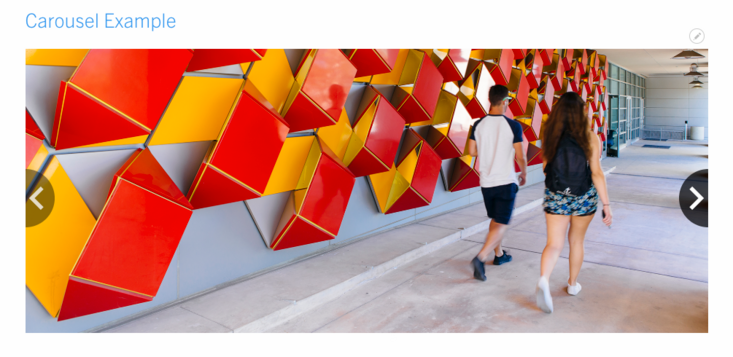
Carousel Slider
Carousel sliders are available as custom blocks. These carousels can be used as a gallery (Galleria is recommended) or more commonly as heroes to be placed in the Hero Panel Content of nodes. Carousels can have one image, multiple images, or use one video. Each slide adjusts in height based on the image ratio.
Each slider in your carousel can display text (title, subtitle, and a button link) that will have an underlay. This text can either be left, right, or center justified by altering option settings. If a Carousel is used on a basic page in the primary content area (non hero content area), it ignores the sizing parameters of "default", "medium", and "large".
Due to the automatic slider nature of carousels, it is not recommended to mix and match videos, nor is it recommended to add more than one video. This will pose an accessibility issue, as the video will continue playing even after it scrolls to another slide.

To create a Carousel
- A. From the admin toolbar panel, navigate to Content -> Blocks -> Add Content Block
or
B. Click on Content, select the Blocks tab then click on the blue +Add content block button. - From the list of available blocks, click on Carousel Slider.
- Configure the available options (outlined below).
- By default, the block is in draft. Save as "Published" so that when this block is placed on a page, it will be viewable by visitors. If you save as draft and place it on a page, even if that page is published, the block will not display until it has published as well.
- Click Save to finish.
Configure Each Slide
Available options for each slide include:
- Background - Select the image or video.
- Text - (optional)
- Slide Caption - this serves as a title for the slide
- Slide Subtext - this serves as a subtitle or very brief description
- Button Text - the text that will be shown as a button
- Button Link - the link for the button (allows for internal and external links)
- Options - Aligns the text left, right, or centered with a semi transparent overlay on top of the background image. Using left or right takes 50% of the side and center will center the overlay vertically.
- Revision information - any time you make an update to this block it's recommended that you include a brief description of the change.
Removing Slides
To remove carousel sliders from displaying, it isn't enough to remove the image, you will need to click on the "Remove" button to the right of the slider image you wish to remove.
Add Carousel to a Basic Page
The following instructions will add the carousel to the primary content area of a specific page.
- Open a Basic Page previously created by clicking on the content's title that you want to display the basic block.
- Click on the Layout tab.
- Select the section and region you want to place the carousel and click "Add Block".
- Find the block description of the carousel block created using the filter or scrolling through the Custom list.
- In the configuration, it is best to check off the option to display title for carousels.
- Click "Add Block".
- Save Layout.
The carousel slider block has now been added to the selected region of your page. This block can be placed on multiple pages. If you want to add a carousel slider to the Hero Panel Content region that will display immediately below the menu, you'll need to be a site builder and use Structure -> Block Layout. View Carousel as a Hero for more information.