Expanding Card Grid
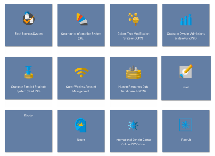
Expanding Card Grid is a custom block component that enables a grid like interface that can reveal more information once clicked. There is a body field for both the main body content and the expander content. A good use for an expanding card grid is a service catalog or training courses.
The first image below is an example of an expanding card grid with four expanding cards in a row. The second image displays the expanding content once a card has been clicked by the visitor.
Things to note:
- The Expanding Cards can be displayed 1, 2, 3, or 4 per row.
- There is no limit to the number of cards an Expanding Card grid can have but please keep performance for editors and visitors in mind.
- A background color, or image, can be chosen for each individual card. The color choices are limited to the theme's color palette.
To create an Expanding Card Grid
Editors and Site builders are able to create expanding card grids. It is an option in the Custom Block Library. They can also be created using the Panelizer. Once an expanding card grid has been created, it will be added to the custom block library.
Custom Block Library
- From the admin toolbar panel, navigate to Content -> Blocks
- Click on the +Add content block button.
- From the list of available blocks, click on Expanding Card.
- Give the Expanding Card a unique custom block description.
- Optionally add content that needs to be displayed above the grid of expanding cards to the "Introduction" tab.
- In the "Card Info" tab, select how many cards per row to display. This can be either 1, 2, 3, or 4 per row and they will size appropriately. In mobile view, they will stack, one on top of the other.
- Add more cards by clicking "Add Expanding Card"
- Click on "Edit" to edit existing expanding cards.
- In Edit mode, under "Card Contents", there is a body section and an expander content section. The first WYSIWYG editor for Expanding Card Body will be what is displayed on the card. The Expander Content will be what is displayed once a visitor clicks on that card.
- Each card has a "Card Background" tab. This is where you can select the background color or image.
- To remove an individual card, click on the drop down arrow near Edit and select "Remove", confirm removal.
- To move cards around, in collapsed view, hold down the arrow crosshair.
- By default, the block is in draft and will not display to those viewing the site, only to authenticated (logged in) users. Once you are ready for the updates to publish, change the state to "Published".
- Click Save to finish.
Add Expanding Card Grid to a Basic Page
- Open a Basic Page previously created.
- Click to the "Layout" tab.
- Decide which section and region to place the block. Add new section if needed. Click on "Add block" of the region.
- Find the block description of the Expanding Cards created and click on the block.
- In the configuration pane, optionally display the title when placed on the page. You can also update the text of the displayed title.
- Click Add Block.
- Scroll up to save the Layout.
The expanding card grid has now been added to the selected region of your page. This block can be placed on multiple pages. Follow the instructions above for each page. Additionally, site builders can use block placement to add a statistic grid to multiple nodes at once.

