This month's release is scheduled to be deployed to Production on Saturday, March 12, 2022 at 6am. Many of these updates will improve your visitor's experiences as there are changes to color contrast, font weights, and attributes. This will in turn improve accessibility scores. New options have been added to a few custom blocks.
Updates for March 12th
Accessibility: News - Color Contrast Not Sufficient Dates on listing pages for the News site now have a darker font color. The dates were formerly light gray.
Captions for images on Basic Pages go beyond image width Captions on basic pages were going beyond an image’s width. The caption and underline should now be the same width of the image.
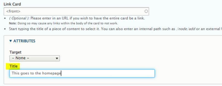
Accessibility - Info Card Link alt You can now add a title attribute to your Info Card if the whole card is a link.
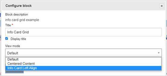
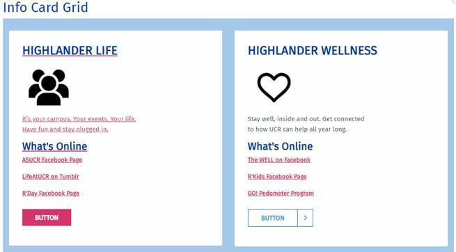
Info Card - New View mode to left align content There is now a new view mode available for Info Cards that aligns the content of each card to the left. It is centered by default.
EqualHeights for columns We’ve added an equalHeights class for the Default and Hybrid themes. We’ve also added two color overlay classes. The two classes are "blue-gradient" (brand blue) and "yellow-gradient" (brand gold). For more details on how to use this, view CNAS's Two Column documentation page.
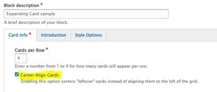
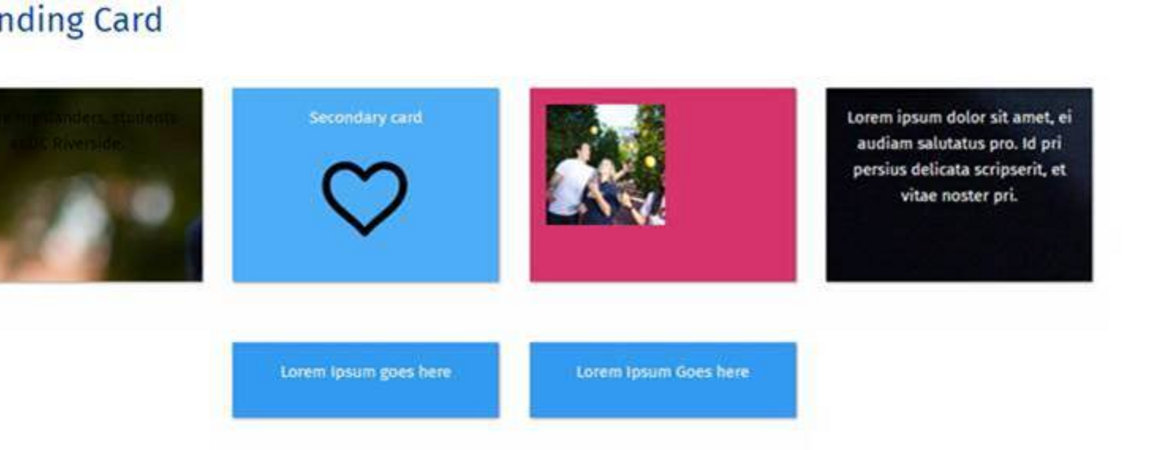
Expanding Card Display Options Currently snapping to the left of the grid, a new field has been added to the Expanding Cards custom block to center the cards. This is perfect for those “leftover” cards you might have on a row.
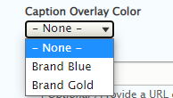
Bubble Grid Enhancement This enhancement reflects a modification to the default and hybrid themes. For text placed in the center of the bubble, we’ve added a new field for caption overlay color. None is the default white overlay, the additions are "Brand Blue" and "Brand Gold". Additionally, the text is no longer forced to uppercase and the font weight and size is larger. s

